Modern Home Design That Marries Minimalism With Warmth and Everyday Function
Struggling with cramped, poorly lit rooms often stems from outdated layouts that ignore how people actually live. Modern home design solves this by prioritizing open, flexible floor plans that connect living, dining, and kitchen spaces for effortless daily flow. It works through intentional use of natural light, minimalist furniture, and neutral palettes, which together make a home feel larger and calmer without extra square footage. The key benefit is adaptive functionality, letting each room serve multiple purposes while remaining visually uncluttered and easy to maintain.
What Defines a Contemporary Living Space in 2025

A contemporary living space in 2025 is defined by its **flexible zones** rather than rigid rooms. You’ll see sliding panels and pocket doors that let a home office shrink into a guest suite by evening, with furniture on casters for effortless reconfiguration. Natural light is engineered through skylights and clerestory windows, while **biophilic materials**—like limewash plaster, raw oak, and terrazzo—add texture without clutter. Smart tech is invisible: hidden outlets in millwork, automated shades that follow the sun, and climate sensors that adjust per zone. The palette leans warm and earthy—olive, rust, and sand—against matte black accents. Storage is built-in to keep counters clear, and every square foot earns its keep, from banquette seating with drawers to staircases that double as bookshelves.

Key Visual Cues That Separate Modern Styles from Simply New Construction
Modern design isn’t just fresh drywall—it’s a deliberate play of visual weight and material honesty. New builds often default to symmetrical windows and flat white trim, while true modern styles use asymmetrical massing: one oversized horizontal pane balanced against a solid, windowless plane. Look for flush thresholds and concealed fasteners; new construction typically shows visible hinges, baseboards, or outlet plates. Modern spaces also blur inside-out boundaries with continuous flooring that extends through frameless glass corners, whereas conventional builds stop materials at the doorjamb. Texture tells the story too—raw micro-cement, brushed oak, or limewash plaster replace the predictable smooth drywall and vinyl plank. Finally, lighting is integrated, not bolted on: linear recessed channels and cove uplighting, not surface-mounted fixtures.

Why Open Layouts and Clean Lines Dominate Current Floor Plans
Open layouts and clean lines dominate current floor plans because they directly respond to how contemporary households actually function. By removing load-bearing walls and visual clutter, seamless spatial flow allows natural light to penetrate deeper and creates flexible zones for cooking, working, and relaxing without physical barriers. Clean lines—achieved through flush cabinetry, concealed storage, and minimal trim—reduce visual noise, making smaller footprints feel larger and more orderly. This design approach supports a lifestyle where daily activities overlap: a kitchen island becomes a homework desk, a living area doubles as a home office. The absence of partitions also improves sightlines for supervision and social connection, while uninterrupted sightlines simplify furniture placement and traffic patterns. Ultimately, this floor plan reduces wasted square footage, lowers maintenance effort, and adapts easily to changing family needs, making it a pragmatic choice for modern living.
How to Blend Natural Light with Functional Interior Layouts

In modern home design, blending natural light with functional layouts requires positioning primary living zones along the southern exposure while placing service areas—like kitchens and utility rooms—toward the north. Use open-plan spatial planning to let daylight travel unimpeded, but anchor circulation paths with low-profile furniture that doesn’t block window wells. For multi-use spaces, install translucent sliding partitions or glass pivot doors that preserve light flow while offering acoustic separation. Light-reflective surfaces, such as matte white ceilings and polished micro-cement floors, bounce daylight deeper into the plan, reducing dependence on artificial lighting. Aligning workspaces perpendicular to windows prevents glare on screens while maintaining ambient brightness. Finally, integrate deep window reveals with built-in seating or shelving, turning daylight thresholds into functional storage and rest zones without disrupting the visual continuity of the open layout.
Choosing Window Placement and Glazing for Year-Round Comfort
For year-round comfort, window placement must work with the sun’s seasonal arc, not against it. South-facing glass captures low winter heat but needs deep overhangs to block harsh summer rays. East and west windows require careful glazing—consider dual-pane, low-E coatings with a solar heat gain coefficient matched to your climate. Place larger panes on northern exposures for glare-free, consistent daylight. Strategically placed thermal mass near south glazing absorbs daytime warmth and releases it at night, smoothing temperature swings. Follow a simple sequence: map daily sun paths, assign functions to each room, then select glazing based on orientation-specific heat gain. Finally, add operable vents or casements at opposite walls to encourage cross-ventilation, letting you purge heat without relying on mechanical cooling.
Strategies for Zoning Open-Plan Areas Without Adding Walls
In open-plan layouts, spatial definition can be achieved through **strategic lighting zones** rather than structural partitions. Suspended linear pendants over dining surfaces visually anchor the area, while recessed ceiling washes define circulation paths without blocking sightlines. A change in flooring material—such as transitioning from wide-plank oak to large-format porcelain—creates a subconscious boundary beneathfoot. Freestanding shelving units, positioned perpendicular to windows, act as translucent dividers that filter daylight while separating living and work zones. Similarly, a low-profile sofa back or an area rug with contrasting texture can delineate a seating pocket. Each strategy leverages light, material, or furniture elevation to preserve openness while imposing functional order.
Selecting Materials That Balance Aesthetics, Durability, and Maintenance
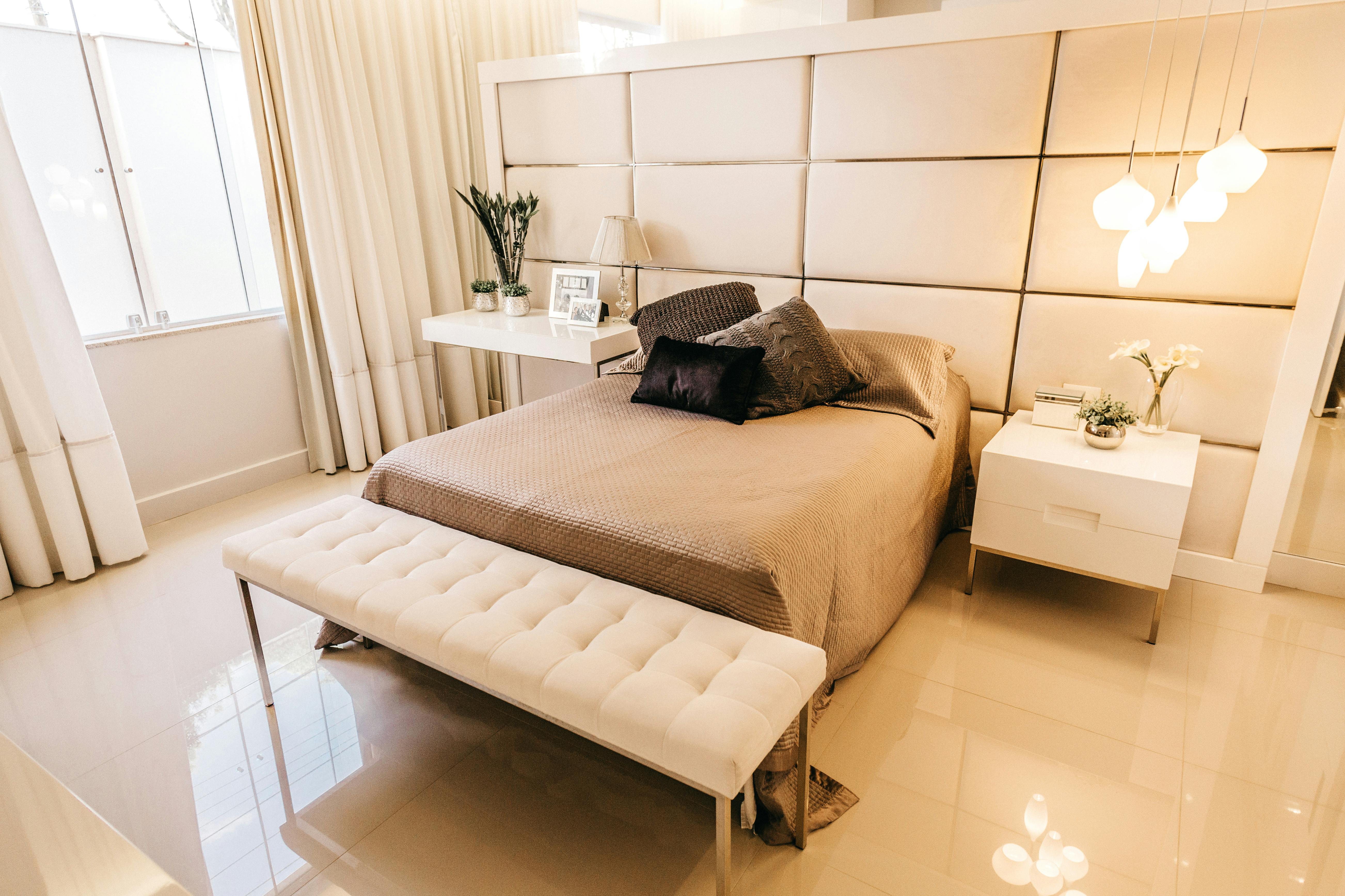
In modern home design, selecting materials that balance aesthetics, durability, and maintenance starts with prioritizing large-format porcelain tile for floors—it mimics stone or wood, resists scratches, and needs only a damp mop. For countertops, sintered compact surfaces outperform marble because they handle heat and acid without sealing, while retaining a sleek matte finish. Use aluminum-framed windows with powder coating over timber; they offer crisp sightlines and never require repainting. On walls, microcement provides a seamless, sculptural look yet is more forgiving than plaster—it won’t chip or fade. Finally, choose UV-stabilized composite decking for outdoor transitions; it keeps the minimalist palette cohesive without the yearly sanding and staining of natural wood. The goal is materials that look intentional but quietly endure daily life, saving you time without sacrificing the clean, layered character of the space.
Comparing Concrete, Wood, and Composite Surfaces for Floors and Counters
When comparing concrete, wood, and composite surfaces for floors and counters, each material dictates a distinct maintenance rhythm. Concrete offers unmatched durability and a seamless, industrial aesthetic, but requires periodic sealing to prevent staining and moisture absorption. Wood brings warmth and timeless appeal, yet demands regular oiling or refinishing to combat scratches and water damage, making it high-maintenance for busy kitchens. Composites, such as quartz or porcelain, provide the most balanced solution, mimicking natural textures while resisting scratches, heat, and spills without sealing. For counters, concrete excels in heat resistance, whereas wood is prone to burns, and composites offer practical low-maintenance aesthetics. For floors, wood scratches visibly, concrete feels cold and hard underfoot, and composite planks offer comfortable, water-resistant performance. Choose based on your tolerance for upkeep versus authentic material character.
| Surface | Durability | Maintenance Level | Best For |
|---|---|---|---|
| Concrete | High (scratch/heat resistant) | High (needs sealing) | Industrial counters, radiant-heated floors |
| Wood | Moderate (prone to dents/moisture) | High (regular oil/wax) | Living areas, low-moisture counters |
| Composite | High (stain/scratch/water resistant) | Low (wipe-clean) | Busy kitchens, wet zones, family floors |
Using Texture and Contrast to Add Warmth to Minimalist Palettes
In a minimalist palette, warmth rarely comes from color—it comes from tactile contrast that softens stark geometry. Pair a smooth, matte plaster wall with chunky linen upholstery, or set a polished concrete floor against a nubby wool rug. The friction between gloss and grain, hard and plush, makes each surface feel intentional rather than sparse. Introduce unlacquered brass or oiled oak for slight sheen and visible grain, then balance them with matte stone or ceramic. This interplay prevents sterile flatness while keeping the palette visually quiet. Even one textural accent—a ribbed glass pendant or ridged ceramic vase—can transform a neutral room from cold to inviting without adding clutter.
Integrating Smart Technology Seamlessly into Your Home’s Architecture
In modern home design, integrating smart technology seamlessly means treating it as a structural material, not an afterthought. Hidden automation begins during the architectural planning phase, where wiring channels are carved into the framing, allowing sensors and control panels to sit flush within drywall. For instance, a lighting system that adjusts to natural daylight is embedded within window reveals, so the technology feels like a passive response of the house itself, not a gadget. Acoustic transparency is achieved by designing motorized blinds and climate vents that operate in silent, pre-programmed rhythms that match the household’s daily flow. The key is to position touchpoints—like climate dials or speaker grilles—at architectural junctions, such as where a wall meets a ceiling beam, making them look like intentional design details. The real goal is that a guest never searches for a switch or a speaker; the home simply reacts to their presence.
Where to Hide Wiring and Sensors for a Clutter-Free Appearance
For a truly seamless smart home, conceal wiring within architectural reveal channels—recessed gaps between drywall and flooring or behind floating paneling. Route sensor cables through hollow baseboards or crown molding, using low-voltage raceways painted to match. Hide motion detectors inside ceiling speaker grilles or behind sheer fabric valances, ensuring the sensor’s lens remains unobstructed. Tuck smart thermostats into picture-frame cutouts with a hinged cover, while door sensors reside within hinge mortises. Even the most advanced occupancy sensor vanishes when mounted inside a vent’s slat, angled to catch foot traffic. For retrofit projects, pull wires through existing conduit alongside lighting circuits, labeling every junction for future access.
Hidden wiring and sensors live in reveals, molding, grilles, and hinge mortises—so technology performs invisibly while staying accessible for maintenance.
Automating Lighting, Climate, and Shading for Daily Convenience
Automating lighting, climate, and shading for daily convenience means programming these systems to respond to your routines and environmental cues without manual input. For lighting, sensors can dim or switch off zones based on natural light levels, while climate systems adjust temperatures per room schedule, learning when you wake or return home. Shading motors align with the sun’s arc, closing east-facing blinds mid-morning to cut glare before cooling kicks in. A single scene—like “evening relax”—can lower shades, dim accent lights, and nudge the thermostat down, creating an integrated adaptive home comfort loop. These automations reduce energy waste and eliminate repetitive adjustments, making your architecture feel intuitively responsive. Scenes can be triggered via voice or app, ensuring effortless control throughout the day.
Furnishing and Decorating for a Minimalist Yet Inviting Feel
In modern home design, achieving a minimalist yet inviting feel hinges on curated restraint rather than emptiness. Choose a neutral base—warm whites, soft greiges—then anchor each room with one sculptural furniture piece, like a plush, low-profile sofa or a live-edge oak dining table, to create visual warmth without clutter. Layer textures deliberately: a chunky wool throw, linen curtains, and a sisal rug add tactile depth, while a single oversized floor lamp (matte black or brass) casts cozy, diffuse light. Edit ruthlessly—keep surfaces bare except for one ceramic vase with dried grasses or a stack of leather-bound books. **How do you prevent minimalism from feeling cold?** Introduce organic materials—wood, stone, cotton—and prioritize comfort in every seating choice, ensuring the sparse aesthetic remains physically welcoming. Finally, leave negative space as intentional breathing room, letting each object breathe and every corner feel purposeful yet lived-in.
How to Choose Statement Pieces Without Overcrowding the Space
To choose statement pieces without overcrowding a minimalist room, anchor the eye with one oversized, sculptural object—a single ceramic vase or a chunky lounge chair—and let every other surface stay visually quiet. Select items with negative space built into their form, like an open-frame stool, so they read as air rather than mass. Limit yourself to one statement per sightline; if the sofa is bold, the coffee table must recede into neutrals. Scale matters more than quantity, so a large abstract painting can replace three smaller wall accents entirely. Place the piece off-center to leave breathing room, and avoid pairing it with patterned rugs or busy textiles that compete for attention.
Color Psychology: Using Neutral Bases with Pops of Bold Accent Tones
Neutral bases—think warm greige, soft off-white, or sandy taupe—do the heavy lifting in a modern minimalist room, creating a calm, airy canvas that feels quietly inviting. Then, the psychology kicks in: a single bold accent—a burnt-orange armchair, a deep teal vase, or a mustard throw—becomes a deliberate emotional trigger, adding energy and warmth without visual clutter. The key is restraint; one or two concentrated pops per space create focus and depth, while too many dilute the effect. This contrast also makes a room feel more personal and lived-in, not sterile. For a balanced flow, echo your accent tone subtly in a pillow or art piece to tie the scheme together effortlessly.
Common Mistakes to Avoid When Planning a Remodel or New Build
The most common mistake in modern design is prioritizing aesthetics over function, leaving you with a home that’s beautiful but impractical. Avoid ignoring the **spatial flow**—an open floor plan fails without clear zones for living, dining, and working. Another frequent error is skimping on storage integration; sleek minimalism collapses when clutter has nowhere hidden to hide, so plan built-ins during the design phase, not after. Also, don’t let window placement be an afterthought—modern homes rely on natural light and passive solar control, so position glazing for thermal performance, not just facade symmetry. Finally, avoid selecting finishes before finalizing lighting design, as modern schemes depend on layered, dimmable fixtures that change how materials appear. Lock in your electrical plan and storage early to prevent costly retrofits.
Pitfalls in Scale and Proportion That Ruin Flow
Oversized sofas shoved into a compact great room instantly fracture spatial flow, making every pathway feel like a slalom course. Conversely, undersized furniture floating in a double-height living area creates disconnected islands that kill natural movement. The biggest culprit is ignoring door swings and divine home corridor widths—when a wide hall narrows abruptly, the transition feels like a physical jolt. Similarly, placing a massive kitchen island too close to a perimeter counter forces awkward sideways shuffling, while a tiny pendant over a huge dining table breaks visual rhythm. Scale missteps don’t just look wrong; they redirect how you walk, turn, and pause, turning an open plan into a series of frustrating bottlenecks.
- Match island depth (max 42 inches) to aisle clearance of at least 44 inches for seamless passage.
- Scale ceiling heights to room volume—low ceilings demand sleeker sofas, not bulky sectionals.
- Align furniture footprints with traffic lanes so the path from kitchen to patio never zigzags.
Budgeting for Hidden Costs in Structural Changes and Custom Features
Structural changes and custom features routinely exceed initial quotes because hidden costs emerge only after demolition or fabrication begins. Load-bearing wall removals require engineered beams, temporary supports, and potential foundation modifications—none of which appear in a basic estimate. Custom millwork, oversized sliding doors, or integrated smart systems demand specialized labor, extended lead times, and site-specific adjustments, often adding 15–25% onto the visible budget. To avoid mid-project stalls, allocate a contingency of at least 20% specifically for these unforeseen engineering and installation expenses. Budgeting for hidden costs in structural changes means pricing every penetration, reinforcement, and finish sample before signing contracts, then tracking change orders weekly. Otherwise, a modern aesthetic with clean lines and flush transitions becomes financially unsustainable.
Q: What is the most overlooked hidden cost in custom features?
A: Electrical and HVAC rerouting behind new walls—moving ductwork or adding recessed lighting in a structural change can double the original line item, so request a separate mechanical audit before approval.